


“Made to measure: How to ensure that your digital products meet your users requirements.”

Millions of people around the world use stairs on a daily basis. We do it without thought. Yet, could any of us give the perfect height of a step? Are we even aware that such a height exists?
The perfect height of the step has been calculated based on the average height, foot length, and knee bend angle of a person, to reduce the number of tripping incidents and lower fatigue levels.
Achieving this height would have certainly been impossible without user research and its thorough analysis. The same approach can be taken for digital products.
When we talk about digital products, User Experience (UX) designers often have to explain that there is no perfect measure that provides a single solution to address all needs. However, just like architects measuring the experience of using stairs, we can improve the products we offer, which translates into a positive user experience with the product.
Applications
We can currently find over 3 million different applications in the Google Store. However, only 5% of them have been downloaded more than one hundred thousand times. Additionally, statistics show that in 90% of cases, even if an application has been downloaded, it usually gets uninstalled or forgotten.
This raises the question of what may be the cause of abandonment of innovative and seemingly necessary applications. One reason could be a poor first impression. Another, judgment based on a selective experience.
Should we then focus on the number of application downloads as our measure? Creators often boast about how many times their application has been downloaded from the online store, but few later mention the number of uninstalls or abandonments of the same application.
What, then, should be the appropriate measure that provides complete data? Let’s take a closer look at our users and what’s on their minds.

The Paradox of the active user
The theory can be applied to digital products and beyond. It originated in 1980 during research conducted at the IBM User Interface Institute. The theory posits that users do not read instructions, but instead immediately start using a software or service.
Let’s imagine a situation where a user enters the Google Store, downloads the calendar app, and attempts to add a dental appointment. If this simple task takes too long we can be sure that the user, recollecting the bad experience, will never add anything else to the calendar. This will be the case regardless of whether the UX designer has developed the one and only, most efficient way for time management.
The paradox of the active user tells us that user experience design must correspond to the user’s actual behaviors: how they make decisions and what influences them. We must remember that we are not designing for the perfect, rational consumer who is willing to change their behavior just to use our digital product.
Logic of a digital product vs. a user’s logic
The logic of a digital product and the logic of a user must complement each other and work together. When a UX designer is mapping out the user’s experience, they pay attention to the moments when the logic of the product and that of the user diverge. These are then carefully analyzed, as this is where the opportunities to increase positive experiences with the product are.
That’s why monitoring a user’s reaction is so valuable, especially in the online world. It is important to consider the metrics we choose to track and the goals we set for ourselves. The challenge may be in selecting the right UX metrics that are both available for analysis and don’t disrupt user experience.
KPIs and UX metrics
Could key performance indicators (KPIs) be one of the metrics used to measure user experience? In this case, the fact that they are not always related to the user’s experience, doesn’t make them the best choice.
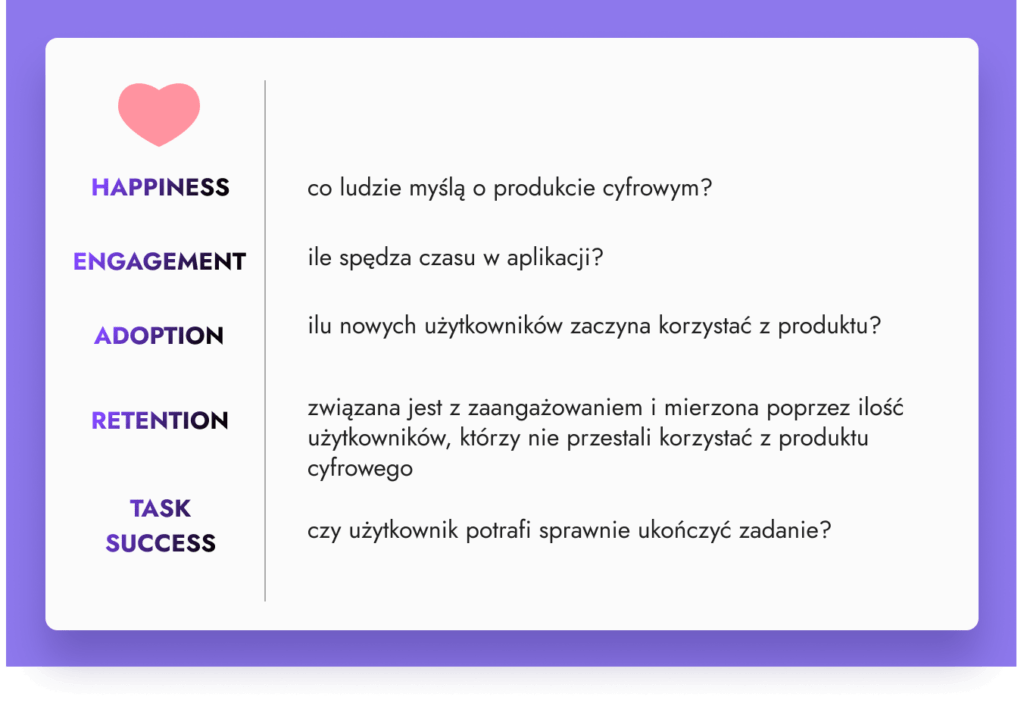
It may be more worthwhile to introduce UX metrics, for example, the HEART framework developed by Google employees. This framework enables the measurement of experiences in individual interface elements as well as in the entire digital product. It consists of 5 metrics that can be used interchangeably; it is not necessary to use them all at once.
HEART consists of:
- Happiness answers questions such as:
- What do people think about a digital product?
- Is it easy to use?
NPS (Net Promoter Score) can be used to measure this by asking users if they would recommend the product or service to others.
- Engagement answers questions such as:
- How often does the user interact with the digital product?
- How much time do they spend on the application?
It is important to remember that sometimes, e.g. the length of a session on a website depends on issues related to the operation of a certain functionality or slow loading times rather than user engagement itself.
- Adoption answers questions such as:
- How many new users started using the product?
- How many new users startded using a specific product functionality?
- Retention is related to engagement and measured by the number of users who have not stopped using the digital product
- Task Success answers questions such as:
- Can the user complete tasks efficiently?
This is usually measured by calculating either the time required to complete a specific task, or the percentage of completed tasks and the number of errors made. This could be, for example, the number of abandoned carts or the average time required to complete the registration process.
- Can the user complete tasks efficiently?
The use of a specific metric should be linked to the goals set for our digital product or its features.
“There is only one boss – the customer”
Sam Walton, one of the founders of Walmart, wrote that “The customer is the only one who can fire everyone from the chairman on down, simply by spending his money somewhere else.“
In the commercial world, money is often the measure of success. However, the amount of money earned does not necessarily indicate whether a user enjoys using the product. We don’t know whether, if our competitor offers a similar and better designed product, our user will not smoothly switch to it from ours.
Information about the user’s experience when interacting with our product is expressed by a different measure than money. For the customer, the product they pay for is a whole story, in which money is only one of many elements. UX designers are a kind of narrator of the whole story, and UX metrics are indicators that determine the level of value of a particular solution, which relates to how the digital product is perceived by users.
E-commerce platforms on the internet
When starting to shop in an online store, we begin with a search. Usually, this is a pleasant moment for us. After selecting the appropriate item, we add it to our cart, check the description, and move on. In the cart, we double-check the price and enter a moment of consideration, sometimes hesitation, whether we actually want to spend the money.
We plan how and when we want to receive our shipment, and we get closer and closer to the payment stage. Here, our uncertainty increases; nobody likes having less money. In our minds, we calculate and analyze whether we really need the product. If we encounter any obstacles at this stage, they can deepen our uncertainty and simply annoy us.
It is our emotions, much more than real need, price, or quality of the product, that decide whether we will spend our money in a particular store. In this area, UX designers have the opportunity to enhance user experience and increase sales at the same time.
How can we measure the quality of user experience? At every stage of the purchasing journey, we can use different techniques and metrics to evaluate it.
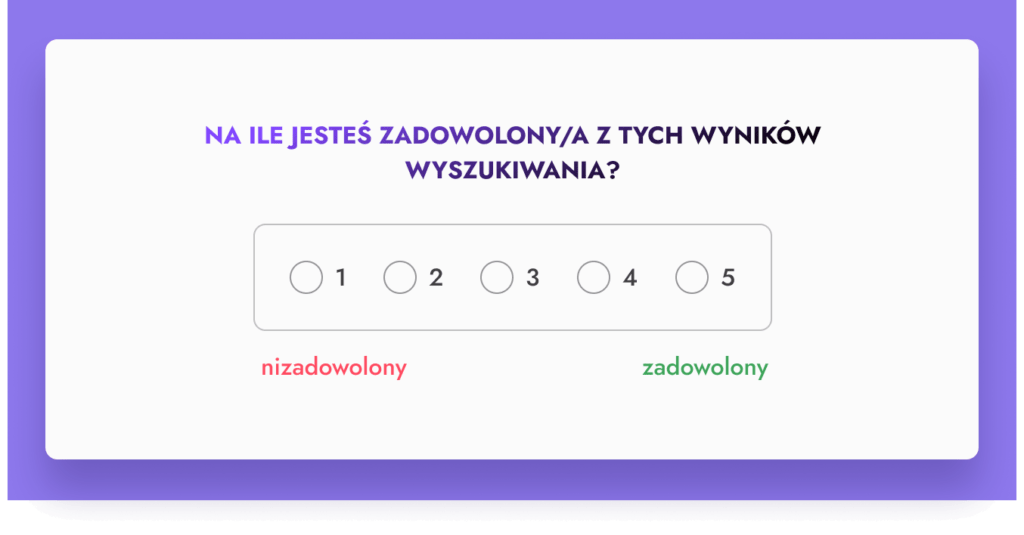
Even before a product lands in our shopping cart, we can ask about the experience. For example, Allegro, the Polish online marketplace, constantly uses its search engine, so they ask customers about their satisfaction with their search results. This allows them to improve the search engine’s performance and make it easier for customers to find what they’re looking for. Allegro uses one of the five metrics in the HEART framework – Happiness.
Analyzing key points of the users experience and the changes that occur between them allows us to identify the next areas for improvement. We can combine financial data with quantitative data to provide information on user flow. This combination allows us to observe which user segments generate satisfactory revenue. However, we should not stop there. We can go a step further and supplement quantitative analysis with qualitative data that allows us to talk directly with our users. Some examples of this include:
- in-depth interviews (IDI),
- satisfaction surveys, and
- analyzing complaint content or support tickets.
Collecting and analyzing this type of data allows us to quickly respond to any market changes and create new solutions or satisfy customer needs and expectations. In this field, time is always of the essence.
Facebook vs IKEA
From a business perspective, the user experience of assembling a new bed is measured differently than that of a customer of an online store or social media platform. However, there are certain common points. Most importantly, users will compare these experiences to their own previous patterns of behavior.
Let’s start with IKEA. Surely, we have all had their famous instructions in our hands. It was in 1956 when entrepreneur Ingvar Kamprad, co-founder of IKEA, began to offer a special way of packing furniture that allowed for transport and self-assembly at home.
The challenge he faced was how to guide the customer through the furniture assembly process so that they would know what to do at each stage?
Extensive research allowed IKEA to introduce simple and minimalistic instructions for furniture assembly. The instructions were designed to easily guide the customer through the entire process, while also preventing moments of frustration during assembly. Irritated users would sometimes even go as far as destroy the furniture in anger, so the designers paid special attention to these moments.
The result is instructions that include pictures of every little screw, as well as various top-down views of the pieces as they appear during the assembly process. Completing each stage is rewarded with a small accomplishment, and completing the entire assembly is a huge achievement.
The IKEA effect
Points out how we tend to attach ourselves to objects, including digital ones, that we have created ourselves. What’s more, we tend to overvalue such items by 60-70%!
This phenomenon is now being used in everyday life, for example, when introducing users to a new application. One example is the language learning app, Duolingo. Employees compared the number of new users who install the app versus those who open the first lesson. Based on the data obtained, they concluded that if users engage in learning even once, they are willing to continue.
In response, the app provides a tutorial before choosing a course, showing how to learn a few words, for example, in Norwegian. This makes us feel that we have already invested our time in achieving something. Now, we are more willing to engage in other courses. Choosing the measure in this way gives Duolingo the opportunity to improve processes and increase user satisfaction.
Facebook: the social media giant
Let’s now take a closer look at Facebook, a well-known social media giant, which investigated their community’s engagement in a similar way. When the platform was first created, many users would set up an account, log in to see what the platform had to offer, and soon after forget that they even had a Facebook account. This was a big issue for Facebook.
By analyzing user data, researchers observed that the number of people invited in the first few days of using the platform correlates with increased frequency of use. Users don’t want to spend time in a place where they don’t have any friends.
Thus, the “7 friends in 10 days” rule was created, based on which an algorithm was developed that encourages users to search for and add friends during registration and shortly thereafter. People who managed to add 7 friends within the first 10 days were considered influencers in social media and algorithms focused on them to encourage content creation, adding friends, or checking out new features. Other giants such as Instagram, Twitter, or TikTok joined Facebook and still successfully use this metric.
We expect what we already know
Let’s consider now whether it is possible to measure the expectation users have for a digital product that is just entering the market? Each business model will typically measure user experience and the success of a digital product differently. Nevertheless, there are some universal measures, as some of the users’ expectations are common.
Jacob’s law
According to this law, users spend a lot of time on other platforms and would like your platform to look similar. Now you probably understand why most online clothing stores look and function in a similar and predictable way. Utilizing Jacob’s law allows our customers to focus on browsing the online store rather than lose time, wondering how it actually works. In short, users focus on what is enjoyable, leaving the rest to what they are accustomed to.
Our habits
However, this rule may not always work in our favor. When a customer is accustomed to receiving praise for every successful action, such as when they successfully save a file, what they will remember most vividly is the moment when they did not receive such praise. It’s worth remembering that users compare experiences not only to our direct competition but also to other platforms they have used, such as an online clothing store compared to a mobile phone subscription website. Users combine common elements of these platforms, such as:
- price
- purchasing process
- shopping cart
- moment of paymeny
Combining these steps definitely simplifies the decision-making process. We can focus on the most essential elements and skip the less important ones.
Which is why it is essential that when designing a service or digital product, we answer the question: what will be the key functionality in the product that distinguishes it from other competitive products? If we can’t answer this question, it’s worth trying to measure and refine it.
Click & Collect
Let’s look at Tesco. They offered their customers the option to shop both in-store and online with home delivery. The second option was intended to satisfy the needs of customers who do not want to waste time searching for products in a large store and then stand in long lines. However, it turned out that courier delivery required the customer to be at home at specific times.
The solution to this problem was the introduction of the click & collect service. It involves ordering products online and picking them up yourself in-store or at a dedicated pickup point. This offer also solved the problematic issue of payment for delivery, which the customers didn’t experience in the same way as picking up their orders themselves.
The click & collect service, or order online and pick up in-store, has evolved over time. Other problems related to it came up, both on the customer’s and the seller’s side. Customers complained about problems finding pickup locations or long queues during the holiday season. The seller, on the other hand, had problems updating inventory levels in real-time.
Click & Collect vs. retail
“Click & Collect” is a service that has undoubtedly benefited retailers. It has allowed them to:
- lower delivery costs,
- reduce the cost of maintaining a fleet, and
- decrease the number of employed couriers.
Given the current situation where inflation has affected all these areas, especially fuel prices, this has a significant impact.
The advantages of “Click & Collect” have also been noticed by many companies outside the grocery industry, not to mention the pandemic, which has contributed to the dynamic development of this service. According to recent studies, by 2025 “Click & Collect” will account for almost 11% of online retail sales in the UK.
Properly identifying the factors influencing the success of a business model allows for the replication of that success. On the other hand, it also allows for the observation of areas that negatively affect user experience and improving them. Tesco has created a type of experience that was not previously available on the market and which is increasingly popular in various industries.
Is there a way to measure the relationship with a customer?
In the case of IKEA, we learn that emotions are an important measure for assessing user experience. Emotions play a crucial role when it comes to retaining users. Applications such as Duolingo, Slack, and Mailchimp are popular because they engage their users to some extent.
In e-commerce, examples of such brands would be Patagonia, a sustainable economy-focused clothing brand, and Nike, which combines the pleasure of sport with digital add-ons in its products. Both of these brands know their customers well and know how to communicate with them. This knowledge is the basis for building an appropriate brand identity.
Get to know your customer
How can we measure such an experience? The brand and the customer must speak with one voice. How can we achieve this? We need to get to know our customer really well. Starting from their demographics and ending with their favorite color, we need to know how our customers think, what troubles them, what doubts they have, and what stands in their way.
Mailchimp is a platform that, among other things, sends marketing emails. They put great effort into getting to know their users. They understand that clicking “Send” and sending an email to thousand customers at once can be stressful. Their response to help in this difficult situation is appropriate communication.
Mailchimp communicates with its users in an easy, relaxing way, using a friendly gorilla character. This gorilla leads the user step by step and shows them what actions they have taken and what will be their effect.
Queries received by customer service can be a great source of knowledge enabling designers to create a well designed product like this. They may concern specific obstacles encountered by users when using the product.
This data enabled the identification of the problem, and after testing various other solutions, lead Mailchimp to the conclusion that it is best to communicate with a subtle sense of humor and by providing clear and concise instructions, which are now their hallmark.
It is good to keep in mind that the language of the brand, identity, transparency, and overall image are strongly related to the business profile. We would design a medical service, which requires a clean, neat design, appropriately chosen colors, and understandable language, differently than we would create a skateboard shop, which needs dynamism, communicates with original graphics, and sometimes uses slang.
We would also speak differently with individual customers, for whom time and their needs matter the most, and with business customers, who pay attention to costs, strategy, and product capabilities. To determine such principles, it is good to observe what elements the user reacts to – e.g., by selecting a specific entry point, clicking on an offer banner, paying attention to an enticing advertising slogan, or the appropriate text on a button. Each group of customers may have its own metrics that are worth analyzing.
Product market-fit
This holy grail of every digital product, contrary to appearances, is not as unattainable as we might think. We just need to look at the appropriate metrics.
One of the most common methods when introducing a new product is “Let’s go all out, let’s see what works and what doesn’t.” This method sometimes works, and sometimes doesn’t. This is associated with a very high risk, especially if a lot of money has been invested in a new product. Some of this risk could definitely be avoided.
Work on new products should be based on the use of UX methods, which allow for:
- testing ideas in the early stages of the project,
- collecting key information about the product (right from the very first prototype!).
The fastest email in the world
The story of the Superhuman platform, which offers “the fastest email in the world” for businesses, can be very inspiring. When entering the market, this company applied the same principle as Dropbox or Eventbrite – to constantly measure the product market-fit in order to be able to optimize it.
A selected group of people had to answer the question: “How would you feel if you could no longer use our product?” The response was: “I would be very disappointed.”
Based on research conducted by Gmail founder Sean Ellis, Superhuman set a threshold of 40% for such responses – “very disappointed”. According to the research, if a startup had less than 40% of such responses, it was often associated with slow growth. The group that gave such responses was then surveyed. They were asked to indicate precisely the benefits of the product that made them satisfied, as well as to identify areas that needed to be examined and improved.
This is a way to discover the weaker areas of a digital product or service, as well as the needs of users that can be addressed. An example is the calendar on our phone. We use it to record important dates. However, this arises from the need to organize our time more quickly and effectively, as well as the desire for appropriate planning.
Similarly, Dropbox users do not perceive the service as just an additional disk. Their need arises from the desire to simplify and facilitate the organization of files, such as through shared folders. It is also important for them to have access to these files anywhere in the world, while feeling that the data they store there is secure.
UX as a competitive advantage
Let’s consider now whether good user experience can give us a competitive advantage. It’s like asking if a well-tailored and fitted suit will fit better?
The needs of our customers are one of the driving forces of business, especially in the digital age where it’s so easy to just copy the look of a competitor’s website. However, users remember not the platforms that are just okay, but those that provide them with the best experiences.
For some users, it will be the time it takes to complete a task. For others, it will be a sense of independence, empowerment, or uniqueness that is provided, for example, by Apple.
Methods and measures for designing user experience are based not only on research and experience, but also on understanding which values are key for our users and focusing on them. On one hand, UX metrics can serve as early warning signs, and on the other, point to new trends.
By measuring user experience and combining it with business metrics, we can find a kind of golden mean between revenue and what is best for our users. If users feel that a company cares about the satisfaction of its customers, they will be more willing to entrust their money to them.


Inne artykuły

SEO + UX – how to combine them effectively?
Web design is a lot more than good UX. A critical component of the process is search engine optimization (SEO). In this blog I will explore how UX and SEO, collectively known as SXO, interact with each other, the significance of this interaction, and how it impacts user satisfaction.

UX audit of beauty e-commerce sites
Online cosmetics sales have enormous potential, which is why we have taken a look at several stores in this category and analyzed trends in the beauty industry. In this article, we share specific tips that will help you increase sales in online drugstores.